Title: Book Cover Design: Classics
Year: 2018
Overview: For this project, I had to make a set of book covers for books within the public domain. For this project, two of the books I chose for this were Beowulf and Dracula, and for both of them I made illustrations for the cover and the layout for the illustration and type.
Audience: My intended audience for the piece would be people interested in classic stories such as these.
Goals: the goal of the project was to create book covers that could give the audience a sort of preview to the story of each of the books.
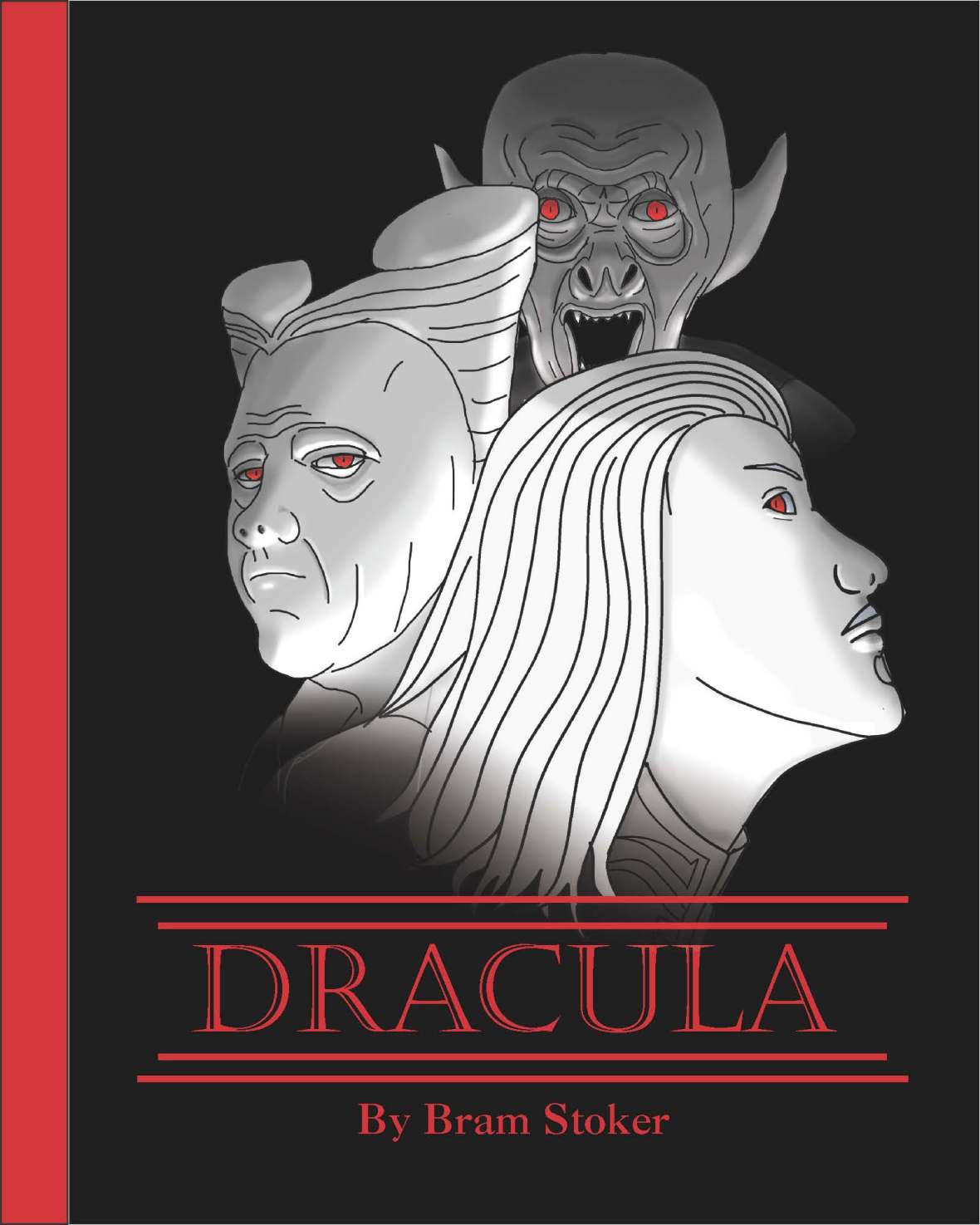
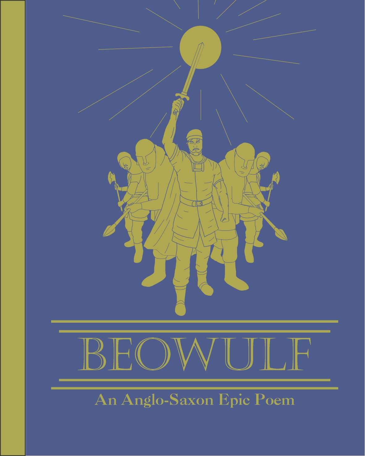
Research: For this project, while it was necessary to look at how other book covers for the novels have been done, it was a bit more necessary to look at the books themselves to find important information to use for the books. This included info such as how the original Dracula by Bram Stoker was not the Nosferatu, but instead something way different, and throughout the book, and the movie based off the book, it showed him as both good and evil, and at his younger age, as someone a bit seductive. As for Beowulf, he was often shown as a leader of sorts and not always going into battle alone. It is also noted that it was necessary to search for imagery of armor from the time of the novel in order to give the characters the right clothing. With these ideas in mind, I went through several sets of sketches until I arrived at the concept sketches shown below.


Digital: From there, I then took several reference photos for the poses and brought them into photoshop, in which I drew over each of them.
For Dracula, I drew over the photos and them modified them by looking at imagery from the movie in order to more accurately depict the characters. I showed Dracula in his young and old forms with red eyes as if though to show the hidden evil within, and then in the back put in one of his more monstrous forms as if though to show the face of this hidden evil within the eyes of the other figures. As for color, I chose to use an off black and white for the figures while adding red to the eyes as a form of spot color to draw more attention to those spots, made the background black so that the figures would contrast more depending on their position (front to back), and made the type red to fit with the red eyes.
As for Beowulf, I started similarly to the previous cover, using the photos I took to draw over to get the pose and proportions of the figures, and then drew the armor over them. I also chose to go at this one with a bit more of a silhouette approach, in which the character with the most details is in front, being Beowulf himself. As for color, I used blue and gold, showing the ideas of royalty and this sort of idea of a golden legend for the piece.