Title: Divergent Posters
Year: 2016
Overview: For this project, I was required to create a set of posters with a design based off one of three words given to me by the director of the project. Though it is noted there is no specific audience for the pieces since the original purpose of the pieces was more as an exercise to improve my skills in the Adobe Suite Programs such as Adobe Illustrator.
Goal: the goal of the posters was to show a design that represented the word that was given to me to work with.
Research: For the research for this project, we were required to study the elements and principles of graphic design, as well as the words we were originally given. In my case, I was given the words ‘Restful’, ‘Parallel’, and ‘Divergent’. With these sets of words, I then proceeded to create a total of 10 thumbnails for each word in Adobe Illustrator. From these, I chose three from each word to present to my peers, getting critiques on each, which in turn allowed me to narrow down which of the thumbnails, as well as my chosen word, I would use for my project.


Digital: After choosing my thumbnail for the next stage, which was the one with circles shown in my sheet for the word ‘Divergent’, in which I made one circle black in comparison to the rest due to the meaning of the words including contrasting and different, which for when I added type to the piece gave me the idea for the phrase “Tending to be Different” which I put on the bottom since I needed the word and meaning on the posters as well as the design from the thumbnail.
As for my choices in color, since the first poster needed to be in black and white, I used black for the background, gray for the circles, and for the different circle, I made it into a white sphere, which further boosted the contrast, and lastly made the type white to unify it with the sphere and contrast from the background. Meanwhile, when making the two-color poster, I ended up using red for the type and sphere to show the idea of passion, while making the background and circles into hues of green to show an idea of sickness. Combined, it seemed to show this idea of being different from what seems to a sick and impure world, using a sort of futuristic looking type with this idea of future dystopia that I got from a few movies and books I had watched/read.
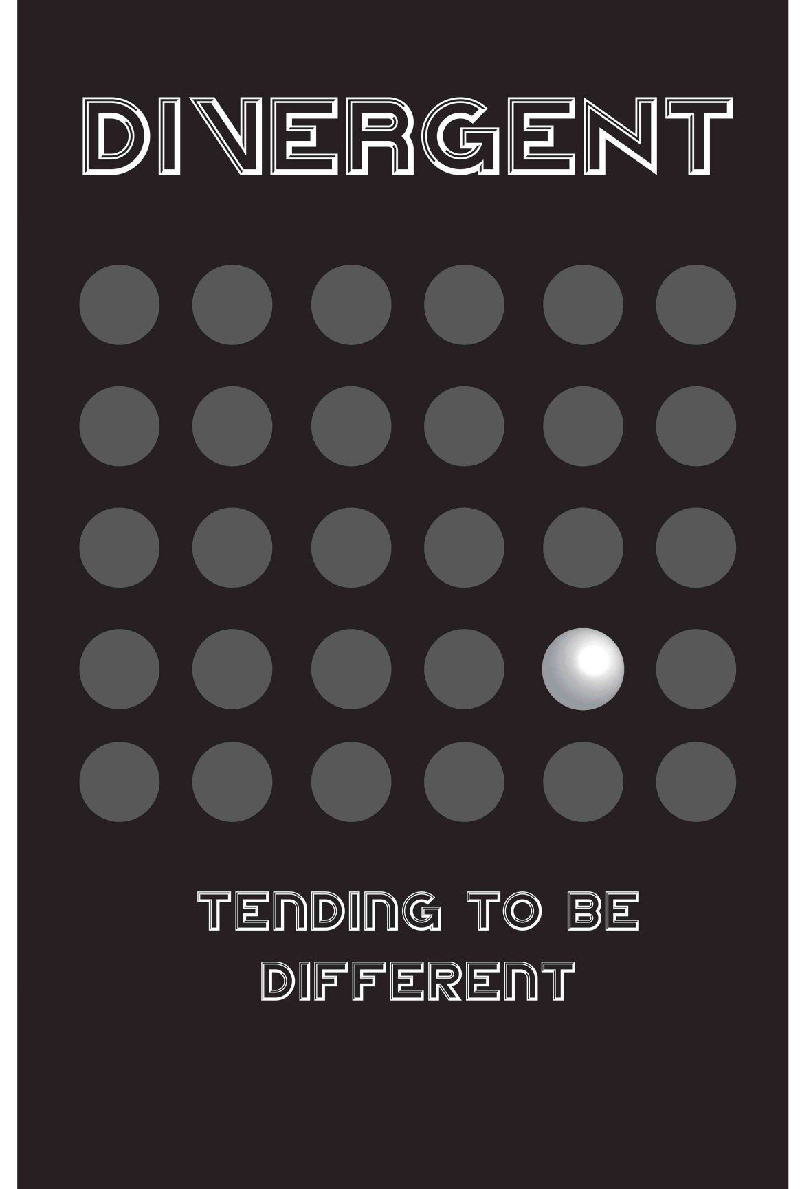
Greyscale Version
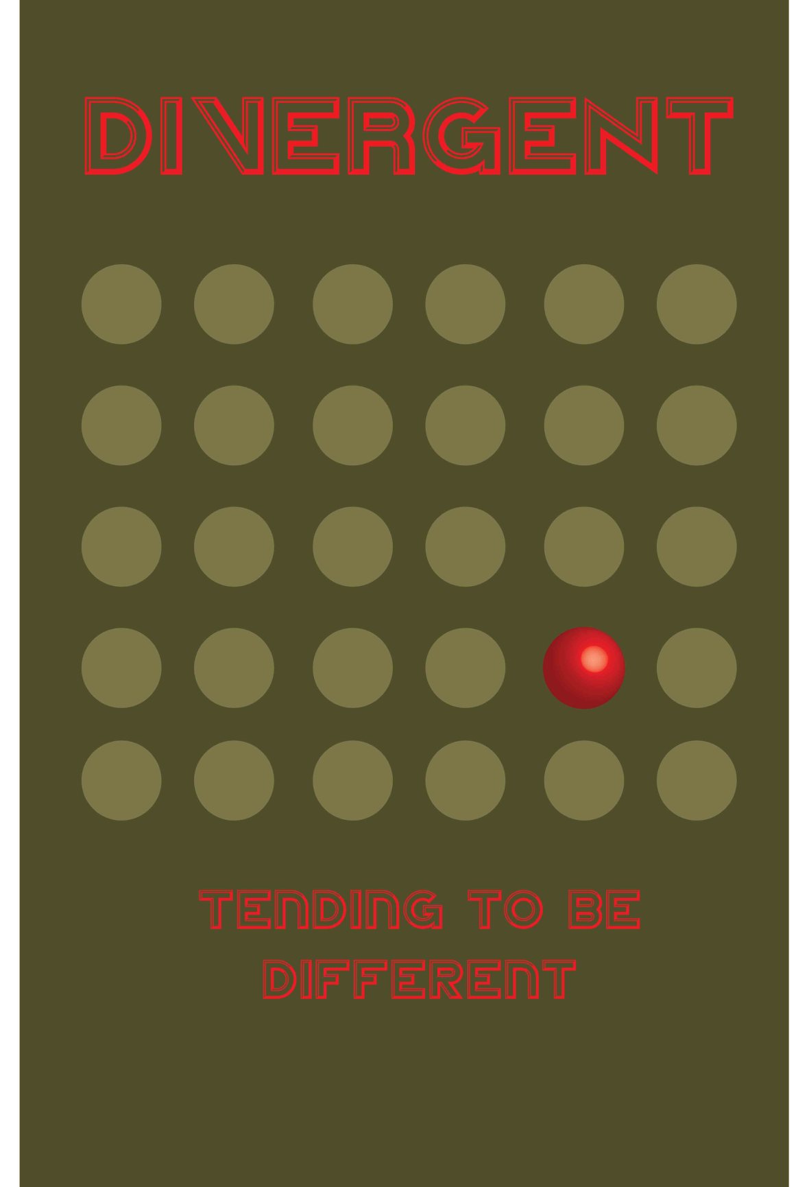
Two-Color Version
