Title: Graphic Novel Spread
Year: 2017
Overview: This project was a bit more of a personal piece, making a graphic novel spread of a part of a novel that I have been working on and have had on my mind for years, seeing the project as a chance to bring that into more fruition.
Audience: The audience for the piece, since it’s a graphic novel spread meant to be done in a manga like style, are young adults.
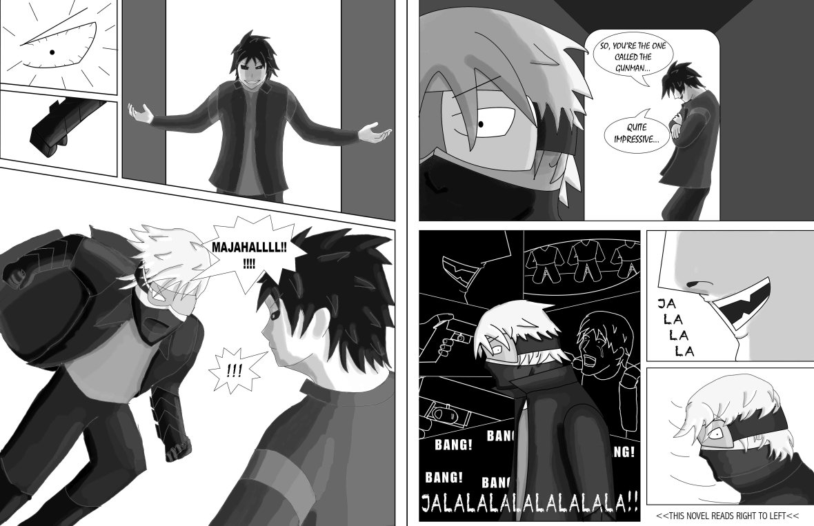
Goal: The goal of this project was to depict the scene between these two characters, in which during this sort of reunion, the protagonist flashbacks to a tragic scene caused by the antagonist shown here, and after snapping, charges at the antagonist in a state of rage.
Research: For this piece, what was mainly necessary for me was to take a look at style and layout. This involved looking at other graphic novels, such as Tite Kubo’s “Bleach” and other graphic illustrations such as the one shown below by Goni Montes. This in turn gave me the ideas of how to render the characters in terms of the drawing and the highlights/shadows.

Kubo, Tite. Bleach. Tokyo, Shueisha, 2001. Accessed 14 Nov. 2017.

Montes, Goni. Joan of Arc. 2014, Lighthouse Media. Behance, https://www.behance.net/GoniMontes. Accessed 12 Sept. 2017.
As for my thumbnails, since I had already had a section of story in mind, it was more of an issue in making the layout of the piece. After getting recommendations from my peers, I then took one of the layouts to transform into a concept sketch, which allowed me to further bring out my intended idea.


Digital: With the concept sketch in place, I then proceeded to work on it in Photoshop while using reference photos I had taken (to get the proportions closer to reality). After laying out the linework with pen and paint tools, I then added hues of black and grey that could be then dodged and burned so that the changes in lighting could be shown. I had also changed the section that showed the flashback into an inverse color, giving it more of the feel of a flashback, as well as tragedy. As for the type, I specifically searched for a type that gave off a horror or insane feel for the antagonist’s lines, meaning to show a bit more of his character to the viewer.
It is also noted that I kept the piece in black and white, since the piece was made to be in a manga like style.