Title: Hohman Shoebox Advertisements
Year: 2016/2018
Overview: This project was to create an advertisement for a product for a specific time period, in which I was required to make an advertisement for a shoebox in the 1910s. And while the original project required me to simply create an advertisement one can find in a magazine, I proceeded a step further by making it so that the advertisement could be put onto other media, such as street billboards and ads for web, as well as coming up with what would be on the shoebox itself.
Audience: The intended audience of the piece was to be middle to upper class American citizens from the era of the 1910s.
Goal: The goal of this piece is to advertise the product, the shoebox, as a durable item that would protect the shoes of the buyers and even make their shoes feel like “you never took them off!!”
Research: For this piece, it was necessary to look up advertisements from the time period to get a better idea of how to design the advertisement. For what I found, I saw advertisements could be in black and white or in color, and often had either simple background, or ones with more than one color, and mainly used serif typefaces for both the headers and the body type. It’s also noted that the way the type is set in the one for Meltonian Cream gives off a sort of professional feel, since this was also a product that not everyone would have access to.

Jell-O. Advertisement. Pinterest. N.p., 1901. Web. 27 Sept. 2016. .
Sylvan Valley Newspaper. Advertisement. N.p., 14 Jan. 1910. Web. 27 Sept. 2016. .

Meltonian and Lutetian Creams. Advertisement. N.p., 1918. Web. 27 Sept. 2016. <https://www.periodpaper.com/products/1918-ad-meltonian-lutetian-cream-shoes-boot-polish-army-london-bottle-jar-feet-194551-ytt1-053>.
As for thumbnails, I focused on the idea of using serif type and the shoes in the box, and chose the design in which a 3/4ths view from slightly above the box with the shoes inside. I then proceeded to do a bit of research into the type of shoes I would use for the box, and make concept sketches for both the shoes I would put in as well as the advertisement itself.


Digital: From there, I then started to work with the project in Adobe Photoshop, following the original design for a majority of it, though I did find it necessary to move the type and shoebox around a bit. For the colors such as a goldish yellow to show the idea of happiness and wealth, while the background used blue to give off the idea of loyalty to the customer. As for the shoes, I took the sketch I did for the concept sketch, and brought it into Photoshop to draw and paint over.
It is also noted that several changes have been made from the original, such as moving the type and desaturating the background to bring more attention to the foreground.
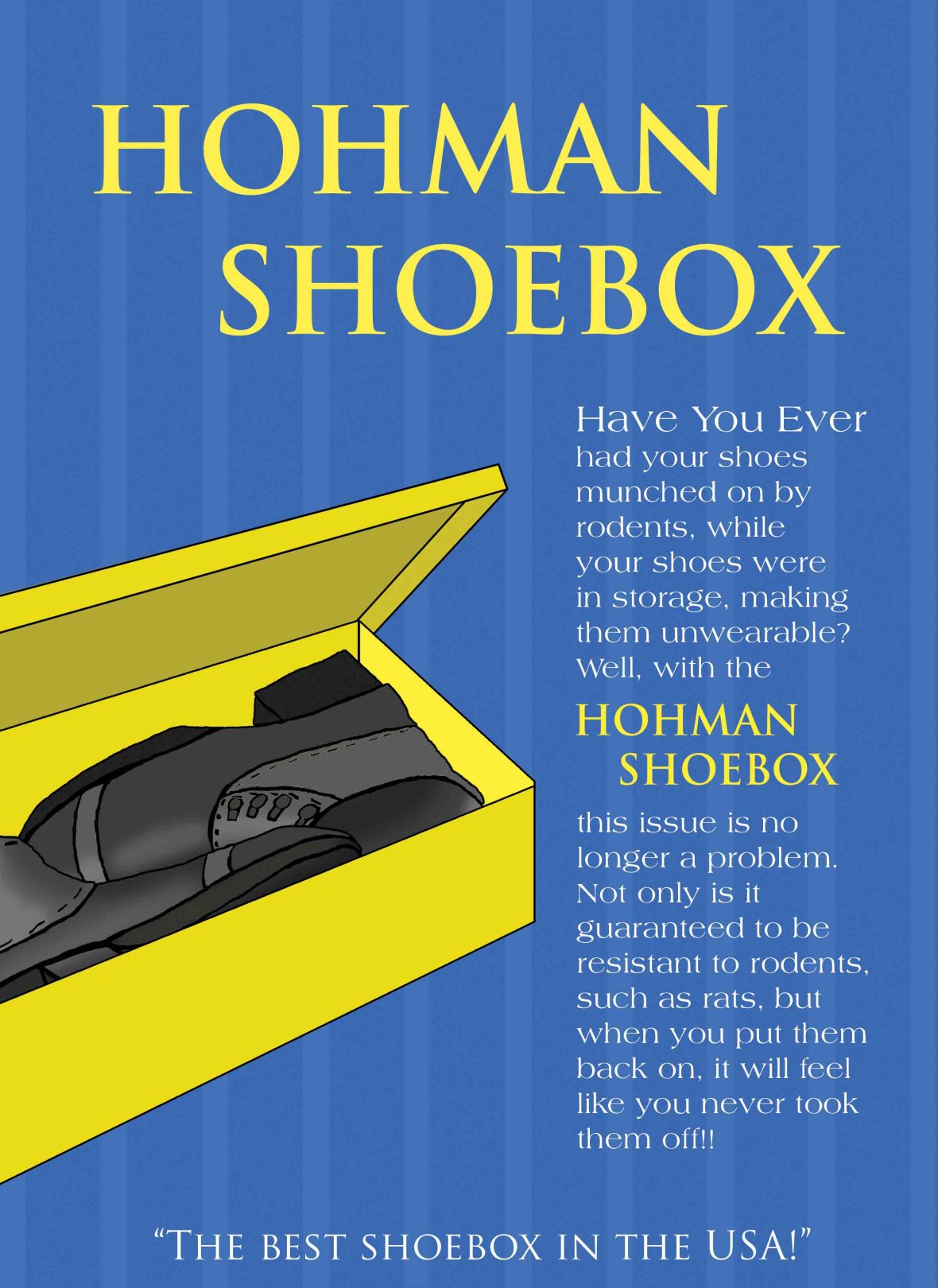
Final Version of the Magazine Advertisement
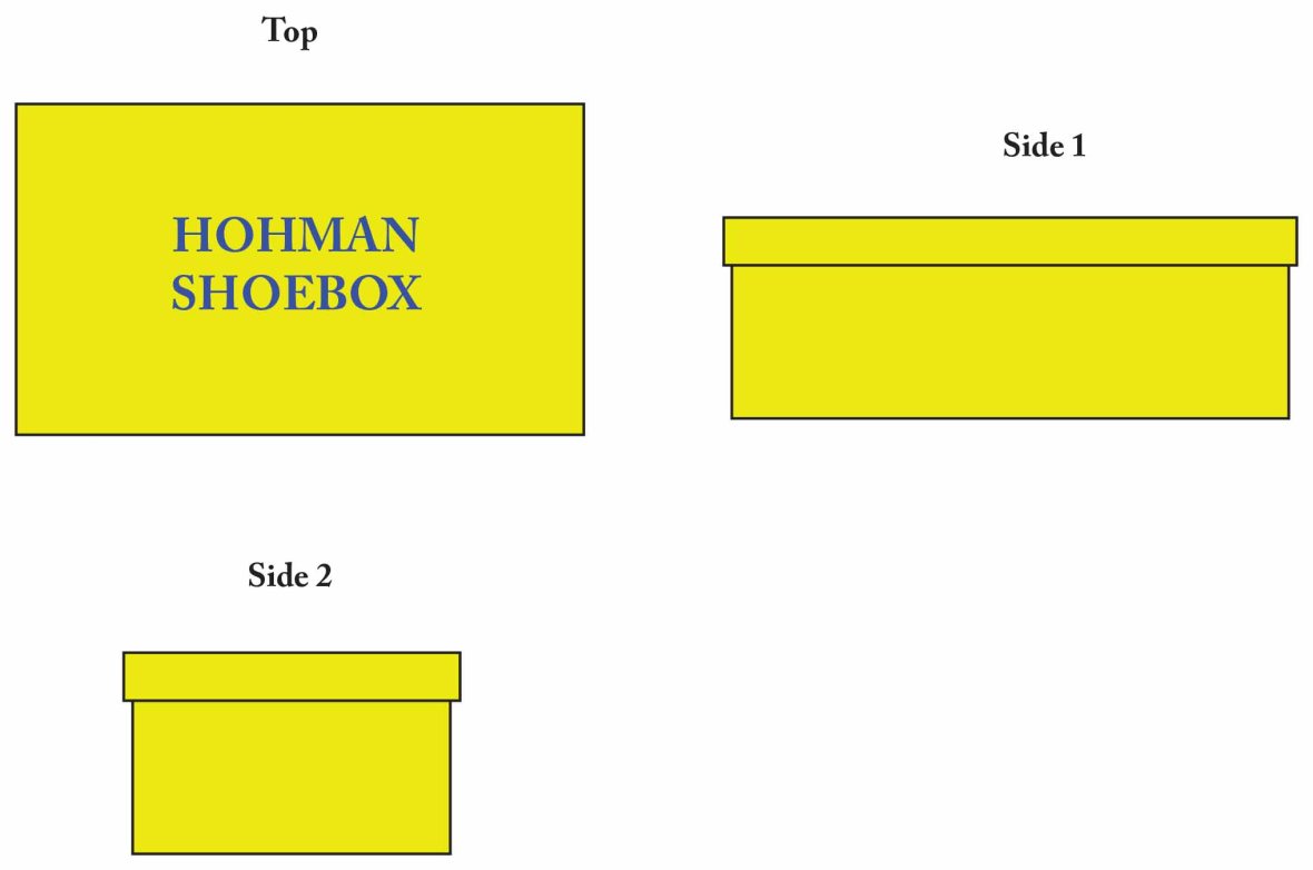
Systems: As for the later additions such as the differing advertisements, it mainly involved removing some of the body type since there wouldn’t be as much time to look at it, such as with billboards, moving the positions of the shoebox and headers, and changing the scale of it due to the different media. As for the shoebox itself, I used the color originally used in the illustration, and then on the top, I put the logo (Hohman Shoebox) in Serif in the color blue to contrast and also reference the original advertisement.
It is also noted that I will likely be making more items for the system design later on as a way to practice making a variety of media.
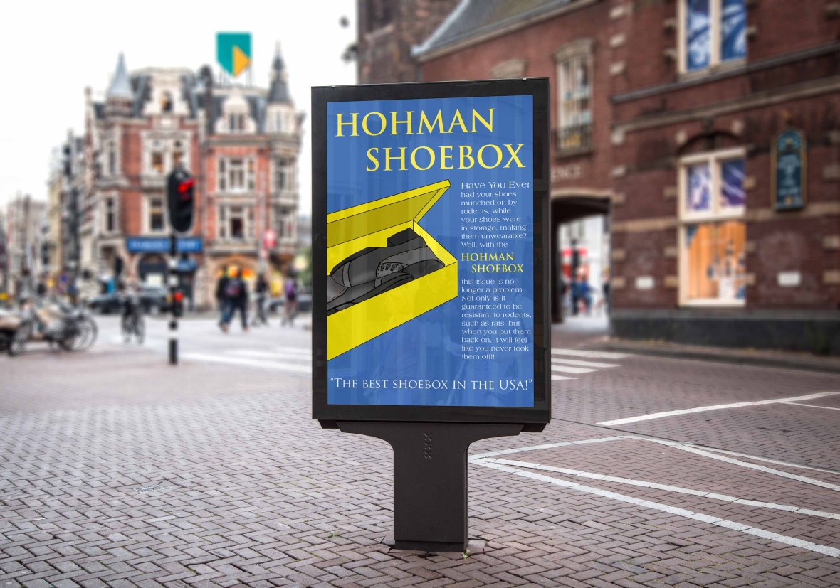
Street Billboard Mockup
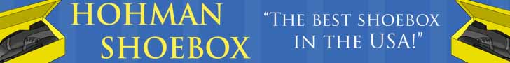
Web Ad Mockup
Shoebox Design
